Features
The COVID-19 Pandemic in Sri Lanka: Contextualizing it geographically – II

By Dr. Nalani Hennayake and
Dr. Kumuduni Kumarihamy
(Continued from yesterday)
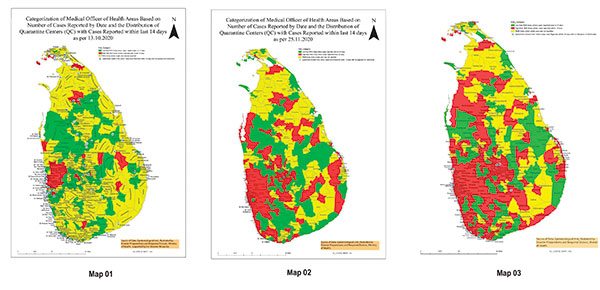
We need to focus on the geographies within or rather internal geographies of the pandemic. Geographically speaking, this pandemic is now fully localized. The map prepared by the Epidemiological Unit of the Ministry of Health, based on the prevalence of positive cases within the ‘last 14 days,’ provides us with three categories of risk areas, based on MOH divisions (see Map 01, 02, and 03). They are (a) MOH areas where a single case is not reported (yellow areas), (b) Low-risk MOH areas where cases were reported before 14 days (green areas), and (C) High-risk MOH areas where positive cases were reported within 14 days (red areas). These maps generally show how the disease has spread across the country over time.
However, according to this criterion, even when a single COVID-19 patient is found ‘within the last 14 days’, that entire MOH area is automatically designated as high risk. It would have been better, if possible, to combine the prevalence of positive cases within the last 14 days with the number of cases found. In the early days of the second wave, the Epidemiological Unit produced such risk maps daily, but they are no longer available to the public. Instead, the same information is presented in a chart marked in red, green, and yellow, thus avoiding a spatial representation – thus a visual effect – of the pandemic.

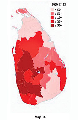
Precise and accurate geo-visualization of COVID-19 cases is vital at this stage. However, the official information on COVID-19 is typically published as district-level aggregated data. The most frequently used geo-visualization method of this aggregated data is district-level choropleth maps. For example, Wikipedia has published a map to visualize the spatial distribution of COVID-19 cases as of December 18, 2020 (Map 04). According to this map, Colombo, Gampaha, Kalutara, Kurunegala, Galle, Rathnapura, and Kandy districts are highly vulnerable. If the data are available at spatial units such as Divisional Secretary Divisions (DSDs) or Grama Niladari Divisions (GNDs), the spatial impression will differ. To illustrate this, we have drawn a map for Kandy district (Map 05) using the MOH level data for a specific period, available at the official Facebook page of the Regional Director of Health Services (Map 05). By December 18, 2020, 757 cases have been reported from Kandy, and the most vulnerable DSDs/MOH areas are Akurana (224) and Kandy MC (178). Ududumbara is reported with no cases where Minipe, Panvila, Nawalapiliya, Hataraliyadda, and Galagedara have reported less than 10 cases.
(To be continued)
(Dr. Nalani Hennayake (nalihennayake@gmail.com) teaches a range of Human Geography courses; Dr. Kumudini Kumarihamy (kumudinik@gmail.com) teaches GIS and Health at the Department of Geography, University of Peradeniya
Peradeniya)